Lab 4: Seasonal Climate Forecasts
Step 1 Acquire potential predictor variables
It is probably easiest to directly copy & paste these values into MATLAB. For example, I copied all data from the first link
>> SolarFlux=[1980 1361.682...
...
2015 1361.351 1361.724 -999.9000... ];
For each time series above, we restrict the analysis to the time period 1980-2013. For the purpose of this exercise you can just use January averages for each of the predictors listed above since they are strongly serially correlated. For the SolarFlux variable, you can extract the specific flux data for January 1980-2013 as
>>SolarFlux=SolarFlux(2,1:34);
Step 1 Acquire potential predictor variables
- Solar Flux at top of the atmosphere: http://climexp.knmi.nl/data/itsi.dat
- January monthly average S&P 500 http://www.measuringworth.com/datasets/sap/
- Eastern tropical pacific sea surface temperatures, NINO3.4 http://climexp.knmi.nl/data/inino5.dat
- North pacific sea surface temperatures, PDO index, http://climexp.knmi.nl/data/ipdo.dat
It is probably easiest to directly copy & paste these values into MATLAB. For example, I copied all data from the first link
>> SolarFlux=[1980 1361.682...
...
2015 1361.351 1361.724 -999.9000... ];
For each time series above, we restrict the analysis to the time period 1980-2013. For the purpose of this exercise you can just use January averages for each of the predictors listed above since they are strongly serially correlated. For the SolarFlux variable, you can extract the specific flux data for January 1980-2013 as
>>SolarFlux=SolarFlux(2,1:34);
Step 2: Create scatterplots of these predictors versus station temperature (or precipitation).
You should extract the average temperature for January-April from your station's data. For example if you have a variable named: stationtemp that is 12 (months) x 120 (years) then you can extract the Jan-Apr average from 1980-2013 as follows:
>>JFMAtemp=mean(Stationtemp(1:4,1980-1894:2013-1894),1);
Note that in the above, we make the assumption that your data goes from 1895-201X.
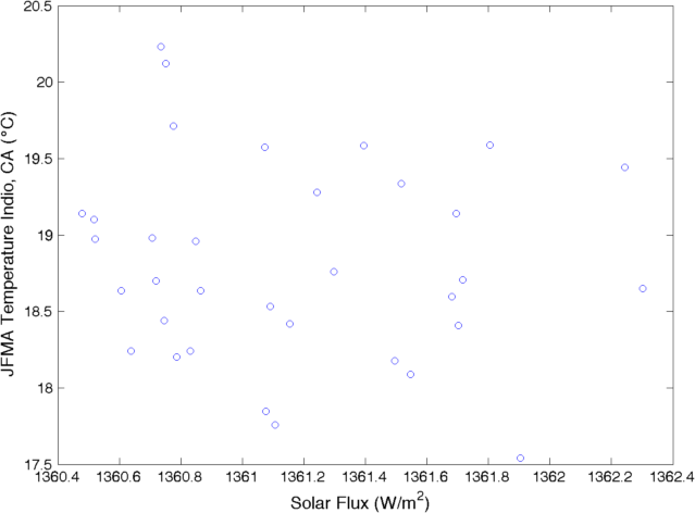
Next you can create scatterplots for your data and each predictor. For example:
>>plot(SolarFlux,JFMAtemp,’o’);
>>xlabel(‘Solar Flux at Top of Atmosphere (W/m^2)’,’fontsize’,14);
>>ylabel(‘Jan-Apr Temperature (\circC)’,’fontsize’,14);
You should extract the average temperature for January-April from your station's data. For example if you have a variable named: stationtemp that is 12 (months) x 120 (years) then you can extract the Jan-Apr average from 1980-2013 as follows:
>>JFMAtemp=mean(Stationtemp(1:4,1980-1894:2013-1894),1);
Note that in the above, we make the assumption that your data goes from 1895-201X.
Next you can create scatterplots for your data and each predictor. For example:
>>plot(SolarFlux,JFMAtemp,’o’);
>>xlabel(‘Solar Flux at Top of Atmosphere (W/m^2)’,’fontsize’,14);
>>ylabel(‘Jan-Apr Temperature (\circC)’,’fontsize’,14);
Step 3: Calculate Correlations
Calculate the linear Pearson’s correlation between each predictor and temperature using the function corr. For example, to calculate the correlation between SolarFlux and temperature:
>> [rval,pval]=corr (SolarFlux,JFMAtemp);
The outputs rval and pval tell you the correlation coefficient, and p-value for the given relationship, respectively. A statistically significant relationship has pval<=0.05.
Step 4: Model development
Statistical models can be useful, but not always. Here you will develop a simple linear model between an ENSO index and station temperature and then use your model to forecast temperature for this Jan-Apr. In MATLAB we can use the function polyfit that performs a linear least squares estimate of the parameters.
>> parameters=polyfit(NINO34,JFMAtemp,1);
We can plot the linear least squares fit on top of scatterplot as you did in step 2 for NINO34
>> plot(NINO34, JFMAtemp,’kd’,’markerfacecolor’,’k’);
>> hold on
>> XXX=min(NINO34):1:max(NINO34);
>> b=polyval(a,XXX);
>> plot(XXX,b,’r’,’linewidth’,2);
Finally, you can literally feed your model the NINO3.4 forecasted on December 1st 2014 for NINO3.4 = +0.7.
>> myforecast=polyval(a,0.7);
